

With over 50 million channels, YouTube is an incredibly competitive platform.
To stand out, you have to offer exciting, informative, and fun content that makes viewers hit those like and subscribe buttons.
However, before that, you have to be noticed first. People don’t click on every video they see, so you need to draw their attention from the start.
And thumbnails are one of the most crucial factors in getting noticed.
So what should a great thumbnail look like? Well, it has to be unique and eye-catching, but also stylish and relevant to the video.
Creating a thumbnail like that is super easy if you use a bit of creativity and choose a great font that would complement the thumbnail perfectly.
In this guide, we will go over some of the best attention-grabbing (and free!) fonts that can be used for your thumbnail, give recommendations on which font to use for your specific niche, and explore the latest YouTube font trends.
10 Best YouTube Thumbnail Fonts to Get A Better Click-Through Rate
Here's our list of the best fonts for YouTube thumbnails and how you should use them to increase your click-through rate:
Fira Sans Extra Bold

Our headliner will be a classic, but striking Fira Sans extra bold.
Why does it work?
This font’s thick, bold strokes make it super easy to read, so it’s perfect for long complex titles (although better keep it short). At the same time, Fira Sans Extra Bold looks modern and elegant.
It is also a perfect choice for visually heavy thumbnails (detailed images, colorful photos, etc.).
Niche fit
Fira Sans Extra Bold is a universal option that will match a video on any topic. However, it is definitely best for educational videos.
Impact

Impact is a great example of an “old but gold” font. Released in 1965, it is still used by many creators who want their videos to stand out from your feed.
Why does it work?
Impact is bold yet simple, which makes it extremely readable. It can easily be used for small titles and suits most thumbnail designs.
Plus, it is famously used by PewDiePie, which is already a good enough reason to give this one a try.
Niche fit
The font is great for engaging fun videos like pranks, reviews, or challenges.
Bebas Neue

Bebas Neue is an elegant font that often shows up in your YouTube feed.
Why does it work?
Bebas Neue is simple and modern. It is easy to read, but also stylish and refined.
Last but not least, it looks great in all sizes, so YouTubers often use it in video content as well.
Niche fit
Because of its simplicity and elegance, Bebas Neue is best used for instructional and educational videos like tutorials or explainer videos.
Badaboom BB

Badaboom BB is the definition of eye-catching. It doesn’t really suit creators with serious thought-provoking content, but it works great for fun and quirky videos made to entertain.
Why does it work?
Badaboom’s bold comic-style look attracts the viewer’s attention right away. It is playful, unique, and goes great with bright colors.
Niche fit
Challenges, pranks, DIY videos, or anything aimed at a younger audience.
League Gothic

League Gothic is a modern variation of a classic Alternate Gothic font that attracts content creators with its elegance and versatility.
Why does it work?
League Gothic looks simple yet interesting.
Its narrow proportions make it perfect for use in small spaces (for instance, when an image takes the majority of your thumbnail)
Niche fit
The font is fairly universal, but its modern twist on gothic style makes it perfect for a book tube.
Dry Brush

Dry Brush is one of the most creative fonts out there. Its hand-painted style makes it look unique and organic at the same time.
Why does it work?
With its irregular strokes and authentic look, the font is hard to miss. It signals that your video will be creative yet relaxed and cozy.
Niche Fit
Dry Brush looks like it was made for travel or spiritual videos. It matches great with a scenic background and cold color schemes.
River Drive

River Drive is another font that highlights creative energy. Its “heavy chalk” look makes it stand out from your feed without drawing attention away from the image.
Why does it work?
River Drive is bold, unique, and easy to read. It is also slightly faded, which makes it blend into the picture flawlessly.
A font like associates with summer, travel, and fun, so it should attract many viewers to your videos.
Niche fit
Videos about travel, music, love, and anything fun and light-hearted.
Config Rounded

Config Rounded is a modern and professional font with a soft and timeless feel.
Why does it work?
The font is characterized by rounded edges and high readability. It is simple, clean, and elegant at the same time.
Config Rounded also adds a touch of approachability and trustworthiness to the designs, which makes it popular among advertisers.
Niche fit
It works great for a business niche - behind the scenes, product videos, ads.
DK Mandarin Whispers

DK Mandarin Whispers is a quirky and attention-grabbing font used by many lifestyle YouTubers.
Why does it work?
The font looks very fun and charming yet has a modern feel.
Because of its brush calligraphy style, it can be easily integrated with a variety of colors and images.
Niche fit
Due to its authentic and friendly vibe, the font suits lifestyle and psychology videos best.
Budmo
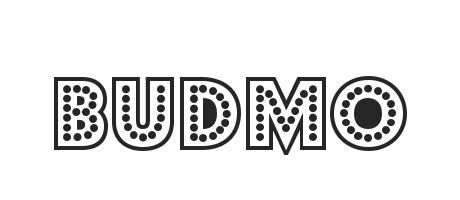
Our last choice is Budmo, a cool bold font with a comic-book-style look.
Why does it work?
Budmo is impossible to miss. It is striking and playful, and with some wisely chosen outline it will look incredibly stylish.
Plus, with everything retro being trendy right now, this font is a great way to draw more attention to your videos.
Niche fit
Geek YouTube Channels that focus on topics like games, pop culture, and comics (obviously).
What YouTube Thumbnail Fonts Are Trendy This Year
So far, we have walked you through some more or less traditional fonts that have been used on YouTube for a while.
There is nothing wrong with timeless classics, but sometimes it won’t hurt to spice things up a little and follow trends.
Here are our top 5 thumbnail font trends for this year:
Retro Condensed Fonts
The 70s are back in fashion.
Using any retro fonts can make your video’s thumbnail look more stylish and eye-catching. And going for condensed options will give you a sleek and modern title that can fit in tight spaces.
Examples of fonts you could use:
- Bahn
- Sunscy
- Neubahn
Calligraphic Fonts
If your YouTube channel is devoted to literature, relationships, or history, you may want to give it an antiquated romantic look.
That is where you should use a set of calligraphic fonts that look especially eye-catching paired with old paper or flower backgrounds.
Examples of fonts you could use:
- Geraldine
- Stylish Delight
- Gallery Typeface
Action Fonts
Comics and superheroes have been on the rise for the last decade and their popularity only seems to grow. That is reflected in design as well.
If you have fun and dynamic videos, try some action fonts. They will help you create bright and eye-popping thumbnails that increase your views.
Examples of fonts you could use:
- Action hero
- Ca Kometo
- Gunterz
Sans Serifs With a Modern Twist
Sans Serif is a classic font family that has been used for hundreds of years (yes, it was first created in 1816).
Lately, however, modern variations of Sans Serif have grown in popularity. These fonts are simple and elegant yet quirky, so every thumbnail design will look 5 times more stylish with them.
Examples of fonts you could use:
- Belgro
- Constructio Grotesk
- Holgar
Classic Modernism Fonts
Minimalism will never go out of style. Classic and versatile modernism fonts are perfect for almost any video, so the only problem would be choosing between them.
Examples of fonts you could use:
- Avalon
- Uni Nova
- Physis
Expert Tips Using YouTube Thumbnail Fonts
Choosing a great font for your video is important, but it is not enough to create a great thumbnail.
Here are a few tips to keep in mind when using YouTube thumbnail fonts:
Be Consistent
After you choose the font and the overall style of your thumbnail, use it in all your next videos. This way you will make your videos more recognizable and contribute to building your personal brand.
Use Colors
Adding the right colors can make a huge difference to your thumbnail. This way your videos will look more stylish and eye-catching.
However, remember that not all colors look good together. You can check some great color combinations here (but keep in mind the readability).
Make Your Thumbnail’s Style Relevant To Your Niche
Your thumbnail must reflect the content of the video. That is why the font and the design should be relevant to your video’s niche.
For instance, if you have a channel about business growth, using quirky and fun fonts like Badaboom or River Drive is not the best idea.
Prioritize Readability Over Style
While creative design and unique color combinations are great, don’t forget about the main purpose of your video thumbnail - to attract viewers’ attention and give them an idea of what your content is about.
That is why when choosing a font for your thumbnail, remember that readability comes first. So a bold font in a color that contrasts well with the background will be a perfect choice.
Optimize For Mobile
Over 70% of all YouTube views come from a mobile device. To reach this major part of the audience, you have to make sure your thumbnail looks equally good on desktop and mobile devices.
To do that, prioritize bold minimalistic fonts that are readable regardless of the screen size.
Bottom Line
Like it or not, a thumbnail is vital for the success of your video. A reason many YouTubers don't make money on YouTube is that they fail to capture attention and convert impressions into views.
That is why you have to put some time and effort into designing your thumbnails, and yes, that includes choosing the right font too.
We hope our guide will help you choose the perfect thumbnail font that will contribute to the success of your videos.
If you want to receive more expert insights and advice on how to grow as a YouTube creator, subscribe to YouTube Hub to get access to premium content.

Join the conversation